
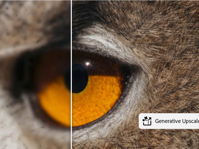

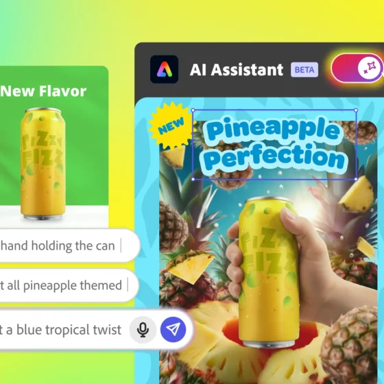
Adobe Photoshop’s New AI Assistant: Big Changes After Adobe MAX 2025
If you’ve ever felt stuck clicking the same sequence of buttons in Adobe Photoshop to ...

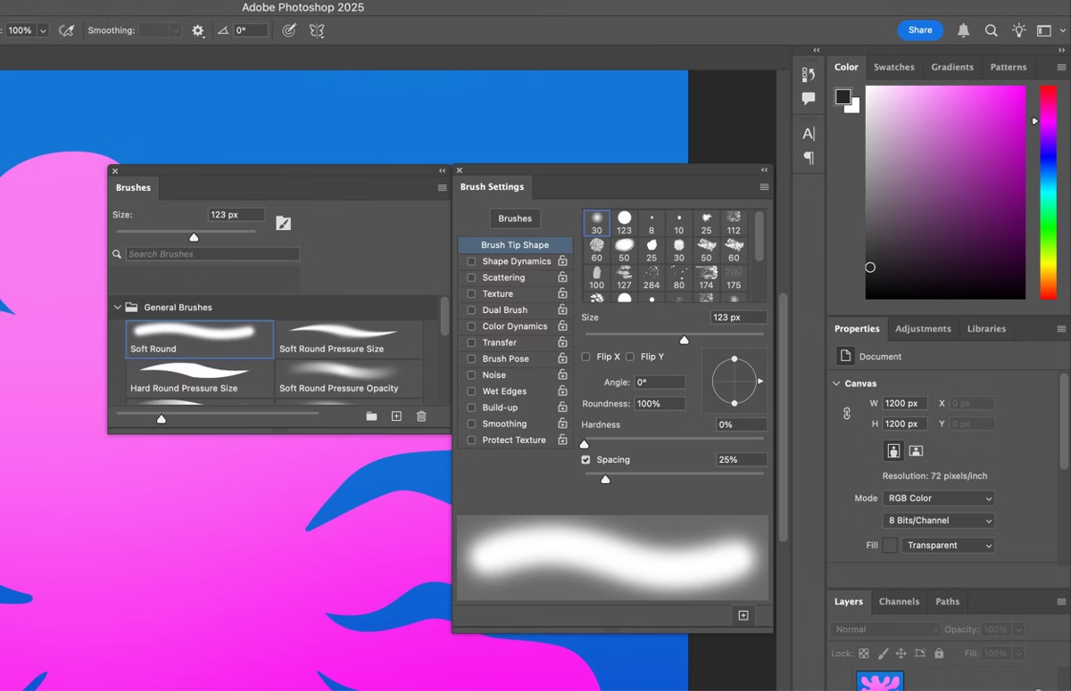
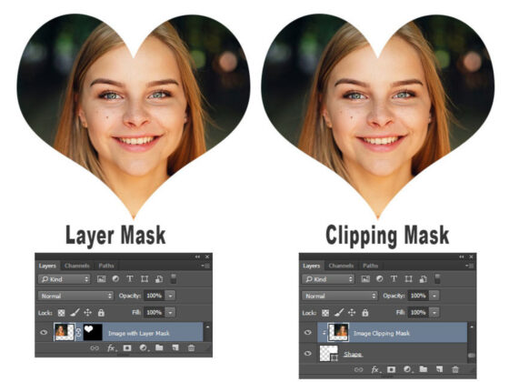
Realistic Shadows Made Easy: Tips for Better Depth in Composites
So, you’ve just cut out a subject, placed it in a brand-new background, adjusted the ...
Adobe’s Subscription Changes: What They Mean for Photoshop Users
Adobe has never been shy about shaking things up—and 2025 is no different. If you’ve ...

New Photoshop Beta Adds Video Editing Features
Adobe just surprised everyone. In its latest Photoshop Beta update, the creative giant quietly added ...
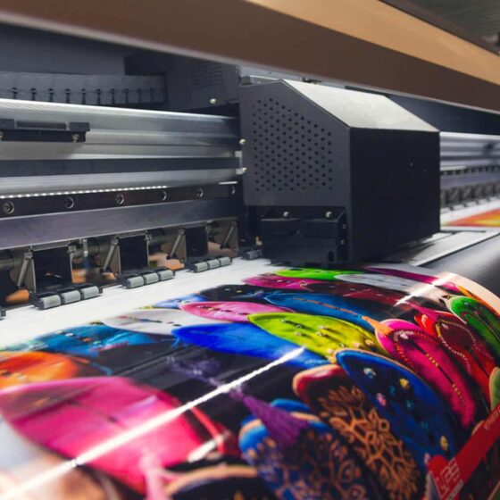
From Photoshop to Print: How to Prep Your Designs for Professional Printing
Designing in Photoshop is only half the journey — getting those visuals to look just ...
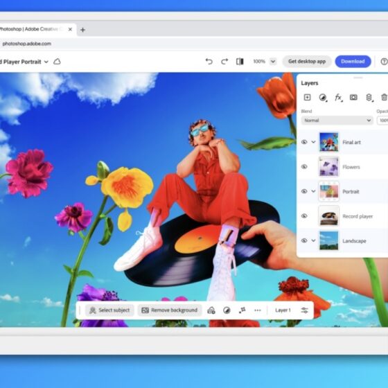
Photoshop is now officially accessible on the iPhone
"Photoshop" has long been synonymous with image editing, and rightfully so. It has been the ...